I’m in Costa Rica, sunny hot days, monkeys and birds everywhere.
In a small beach town called Tamarindo, which attracts swarms of tourists, surfers, hippies and retired folk looking to get away from the cold, cold north.
Life is good, indeed.
The other day while walking home I noticed in the window in one of the funky little clothing stores, one of the ugliest pieces of men’s clothing…ever.
It was a black, ‘muscle shirt’, with multicolored neon bright cannabis leafs all over it.
My first thought was: “Who’d buy a wife beater shirt?”
Then I realized I was wearing one. But not like that one of course.
I swore I’d never wear a “muscle” shirt, but gave in two years ago.
Too warm down here, too dam comfortable.
But black, with bright fluorescent neon weed leafs all over it? Ugh!
And fishnet see through mesh fabric no less. Double ugh!!
But if you’re gonna wear them, at least have some class. Some style.
And this one! U*G*L*Y…..nothing less.
Which made me think….“I bet this is a marketing strategy. Designed to grab your attention.”
This store is known for funky cool stylized, offbeat, retro selection of young hip clothing.
Why not highlight this abomination?!
For effect, no less. No doubt. It grabs your attention.
Grabbing your attention is one of the foundations of good marketing.
Done right, of course.
One of the very best marketing strategies for photographers is the display. You know, in a mall, a store, restaurant, instagram, facebook….all are displays in a sense.
We put our work out there, for all to see. To “grab” attention. Over and over.
And it seems this strategy favors the bold. Certainly worked for me.
Here’s my short list of display ideas:
*In our studio we have an 8’x12′ billboard on the side of our building, facing one of the busiest streets in our city.
*Business cards
*ALL social media….daily posts
*website blogging
*store front…(my two large windows are covered each with display images-the kind you can’t see in, but can see out- perforated is the term used I believe)
*sales room…high impact large display images and well appointed decor…impact!
*mall/tradeshows/art shows…any and all displays at events in your city….old school, very, very effective
Some free, some paid, all effective attention grabbing publicity. One of my favorite marketing strategies and a must for any photography studio.
Be shameless, brave, bold….like a multicolored neon cannabis leaf encrusted muscle shirt on display.
I talk about this at length in my marketing manuals I’ve created (3 so far), in the monthly marketing mastermind meetings I run.
By far, as a photographer, you need to grab their attention. They ain’t gonna come looking for you.
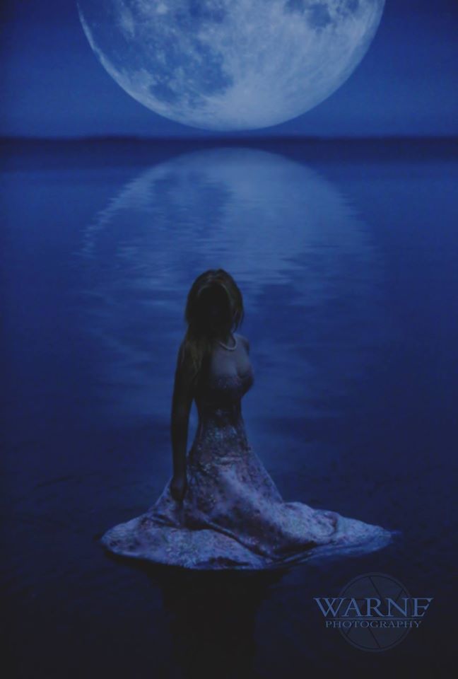
Last night during our marketing mastermind with special guest Warne Noyce, he showed us an image he created right in his front yard, in the water. (he lives in the boonies on a beautiful lake.)
The image was of a high school senior in her prom dress, in the water, with a huge giant moon on the horizon, reflected in the water. (0bviously added, but very effective)

Would anyone want that style of shot? Maybe some, maybe not.
An image with impact that draws them in. Pushing his brand of uniqueness and style.
Like a black see through mesh neon cannabis leaf encrusted wife beater shirt.
Yours in photography and success,
Robert Provencher
P.S. Members can watch the repaly of last nights presentation with Warne here.
P.P.S. My entire collection of marketing manuals, replays and meetings are ALL part
of your membership.


